介绍
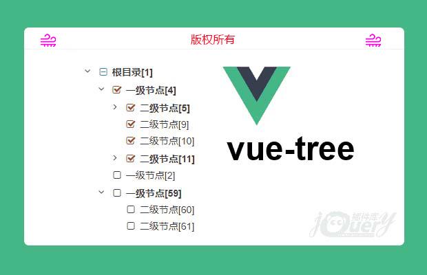
一个简单灵活的vue.js树形组件,可作为插件使用,也可直接作为component使用
使用时只需传入一个树形数据绑定。
组件还提供了handle事件,你可以很方便的在组件上监听。
不止这些,
高效的计算方法
可定制的选择框样式
复选框显示可选
初始化展开层级
初始化勾选
可选的按钮图标
父节点半选状态支持
显示字段自定义
事件监听
...
安装
1 2 | # installnpm install vue-simple-tree --save |
数据规范
treeData
id 必要属性,类型 Number
label 必要属性,类型 String,可自定义,默认 label,如: options.label:'some_field'
children 非必要,类型 Array
treeData示例
./tree.json
1 2 3 4 5 6 7 8 9 10 11 12 13 14 15 16 17 18 19 20 21 22 23 24 25 26 | { "data": [{ "id": "1", "label": "Root", "children": [ { "id": "2", "label": "Node2" }, { "id": "3", "label": "Node3" }, { "id": "4", "label": "Node4", "children": [ { "id": "5", "label": "Node5" } ] } ] }]} |
使用示例
有两种使用方法:
1.局部注册
App.vue
1 2 3 4 5 6 7 8 9 10 11 12 13 14 15 16 17 18 19 20 21 22 23 24 25 26 27 | <template> <div id="app"> <vue-tree v-model="checkedIds" :tree-data="treeData" :options="options" /> </div></template><script>import VueTree from 'vue-simple-tree/src/components/VueTree.vue'import Tree from './tree.json'export default { name: 'app', components: { VueTree }, data () { return { // 复选ids,可传入id数组作为初始选中状态,如[3,4,8] checkedIds: [], // tree数据 treeData: Tree.data, // 设置项 options: {} } }}</script> |
2.通过插件形式全局注册
main.js
1 2 3 4 5 6 7 8 9 10 11 12 13 14 15 16 17 18 19 20 21 22 23 24 25 26 27 28 29 30 31 | import App from './App'import Vuetree from 'vue-simple-tree'Vue.use(Vuetree)new Vue({ el: '#app', template: '<App/>', components: { App }})App.vue<template> <div id="app"> <vue-tree v-model="checkedIds" :tree-data="treeData" :options="options" /> </div></template><script>import Tree from './tree.json';export default { name: 'app', data () { return { checkedIds: [], treeData: Tree.data, options: {} } }}</script> |
设置选项
以下是默认设置.
你可以在options里覆盖默认设置,或仅设置若干项options: {someOption: optionValue}
你也可以绑定一个空的对象:options="{}"或直接忽略options
设置说明
| 名称 | 类型 | 默认值 | 说明 |
|---|---|---|---|
label | String | label | 节点名称字段 |
checkbox | Boolean | true | 是否启用选择框 |
checkedOpen | Boolean | true | 选中时是否展开节点 |
folderBold | Boolean | true | 目录是否加粗显示 |
openIcon | String | fa fa-plus-square | 展开按钮 |
closeIcon | String | fa fa-minus-square | 收缩按钮 |
checkedIcon | String | fa fa-check-square-o fa-fw | 选择框选中图标 |
uncheckedIcon | String | fa fa-square-o fa-fw | 选择框未选中图标 |
halfCheckedIcon | String | fa fa-minus-square-o fa-fw | 选择框半选中图标 |
idsWithParent | Boolean | true | v-model数据是否包含目录,如果只获取叶子节点设置为false |
depthOpen | Number | 0 | 初始化时展开层级,根节点为0 |
-- 注意:默认设置使用了 font-awesome 图标, 如果你继续使用默认设置,请确保这些图标能正常使用。
-- 你也可以使用如 iconfont 的图标库,使用方法见 帮助 中的font-class引用方法章节
如何获取选择框数据?
使用 v-model="ids" 获取选择框数据( ids 是一个只包含 id 的数组)
默认情况下 ids 包含所有祖先节点,如果你想获取只包含叶子节点(所有目录被过滤掉),设置 options.idsWithParent 为 false
事件
该组件实现了单击节点名称事件 handle,当前操作节点作为参数传递
监听器
如需要,你可以选择监听 handle 事件
1 2 3 4 5 6 | <vue-tree v-model="ids" :tree-data="treeData" :options="options" @handle="someActions"/> |
为绑定的事件定义监听方法
1 2 3 4 5 | methods: { someActions (item) { this.message.push(`节点 ${JSON.stringify(item)} 'handle' 事件`) }} |
HTML结构
组件渲染的html结构为嵌套的 ul, li 结构
如下:
1 2 3 4 5 6 7 8 9 10 11 12 13 14 15 16 17 18 19 20 21 22 23 24 25 26 27 | <ul class="vue-tree-list"> <li class="vue-tree-item"> <div class="item-wrapper"> <span class="item-toggle"></span> <span class="item-checkbox"></span> <span class="item-label"></span> </div> <ul class="vue-tree-list"> <li class="vue-tree-item"> <div class="item-wrapper"> <span class="item-toggle"></span> <span class="item-checkbox"></span> <span class="item-label"></span> </div> </li> ... </ul> </li> <li class="vue-tree-item"> <div class="item-wrapper"> <span class="item-toggle"></span> <span class="item-checkbox"></span> <span class="item-label"></span> </div> </li> ...</ul> |
样式
如果你想修改默认样式,一切都为你准备好了,只需要重新定义以下css类
1 2 3 4 5 6 | .vue-tree-list.vue-tree-list .vue-tree-item.vue-tree-list .item-wrapper.vue-tree-list .item-wrapper .item-toggle.vue-tree-list .item-wrapper .item-checkbox.vue-tree-list .item-wrapper .item-label |
情景样式
1 2 3 | .item-checkbox .checked.item-checkbox .unchecked.item-checkbox .half-checked |
特别申明:
本站所有资源都是由网友投稿发布,或转载各大下载站,请自行检测软件的完整性!
本站所有资源仅供学习与参考,请勿用于商业用途,否则产生的一切后果将由您自己承担!
如有侵权请联系我们删除下架,联系方式:lei1294551502@163.com
- 上一个特效: tab栏背景跟随鼠标缓动
- 下一个特效: 纯css3响应式导航