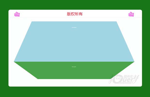
插件描述:cubeTransition.js是一款超酷3D立方体页面切换过渡动画jQuery插件。该插件通过CSS 3D transforms 和 CSS Animations来制作平滑的立方体过渡动画特效。
cubeTransition.js
使用方法
在页面中引入jquery.min.js,jquery.touchSwipe.js(用于移动触摸事件),mousewheel.js(用于鼠标滚动事件),和cubeTransition.js文件。
1 2 3 4 | <script src='js/jquery.min.js'></script><script src='js/mousewheel.js'></script><script src="js/jquery.touchSwipe.js"></script><script src="js/cubeTransition.js"></script> |
HTML结构
基本的页面HTML结构如下:
1 2 3 4 5 6 | <div id="cubeTransition"> <div><h2>cubeTransition.js</h2></div> <div><h2>Elegant,</h2></div> <div><h2>exected!</h2></div> <div><h2>Simple.</h2></div></div> |
CSS样式
为界面添加下面的基本CSS样式:
1 2 3 4 5 6 7 8 9 10 11 12 13 14 15 16 17 18 19 20 21 22 23 24 25 26 27 28 29 30 31 32 33 34 35 36 37 38 39 40 41 42 43 44 45 46 47 48 49 50 51 52 53 54 55 56 57 58 59 60 61 62 63 64 65 66 67 68 69 70 71 72 73 74 75 76 77 78 79 80 81 82 83 84 85 86 87 88 89 90 91 92 93 94 95 96 97 98 99 100 101 102 103 104 105 106 107 108 109 110 111 | * { margin: 0; padding: 0;} html, body { overflow: hidden; height: 100%;} #cubeTransition { position: relative; width: 100%; height: 100%; -webkit-perspective: 1200px; -moz-perspective: 1200px; perspective: 1200px;} #cubeTransition div { min-height: 100%; width: 100%; position: absolute; top: 0; left: 0; backface-visibility: hidden; transform: translate3d(0, 0, 0); transform-style: preserve-3d; font-size: 5em; color: #fff; display: none;} #cubeTransition h2 { position: relative; top: 200px; margin: 0; font-size: 1.5em; text-align: center; text-shadow: 1px 1px 0px rgba( 0, 0, 0, 0.1 );} .top { z-index: 9999 } .rotateCubeTopOut { transform-origin: 50% 100%; animation: rotateCubeTopOut .6s both ease-in;} .rotateCubeTopIn { transform-origin: 50% 0%; animation: rotateCubeTopIn .6s both ease-in;} .rotateCubeBottomOut { transform-origin: 50% 0%; animation: rotateCubeBottomOut .6s both ease-in;} .rotateCubeBottomIn { transform-origin: 50% 100%; animation: rotateCubeBottomIn .6s both ease-in;} @keyframes rotateCubeTopOut { 50% { animation-timing-function: ease-out; transform: translateY(-50%) translateZ(-200px) rotateX(45deg); } 100% { opacity: .3; transform: translateY(-100%) rotateX(90deg); }} @keyframes rotateCubeTopIn { 0% { opacity: .3; transform: translateY(100%) rotateX(-90deg); } 50% { animation-timing-function: ease-out; transform: translateY(50%) translateZ(-200px) rotateX(-45deg); }} @keyframes rotateCubeBottomOut { 50% { animation-timing-function: ease-out; transform: translateY(50%) translateZ(-200px) rotateX(-45deg); } 100% { opacity: .3; transform: translateY(100%) rotateX(-90deg); }} @keyframes rotateCubeBottomIn { 0% { opacity: .3; transform: translateY(-100%) rotateX(90deg); } 50% { animation-timing-function: ease-out; transform: translateY(-50%) translateZ(-200px) rotateX(45deg); }} |
特别申明:
本站所有资源都是由网友投稿发布,或转载各大下载站,请自行检测软件的完整性!
本站所有资源仅供学习与参考,请勿用于商业用途,否则产生的一切后果将由您自己承担!
如有侵权请联系我们删除下架,联系方式:lei1294551502@163.com
- 上一个特效: 非常漂亮的后台管理软件模板
- 下一个特效: jQuery酷黑音乐播放器