插件描述:这是一组效果非常炫酷的垂直分页导航按钮动画特效。这组特效通用18种效果,可以用于制作幻灯片、页面切换和其它容器组件切换的分页导航按钮
简要教程
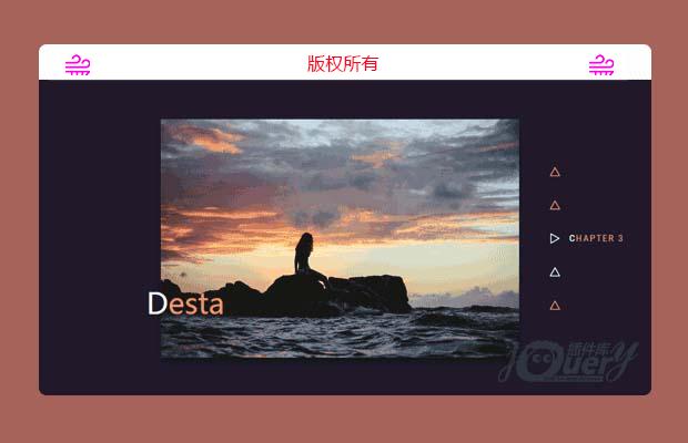
这是一组效果非常炫酷的垂直分页导航按钮动画特效。这组特效通用18种效果,可以用于制作幻灯片、页面切换和其它容器组件切换的分页导航按钮。
使用方法
HTML结构
垂直分页导航按钮动画特效
生成上面的垂直分页导航效果的HTML结构如下:
1 2 3 4 5 6 7 8 9 10 | <nav class="nav nav--timiro"> <button class="nav__item" aria-label="Item 1"></button> <button class="nav__item nav__item--current" aria-label="Item 2"></button> <button class="nav__item" aria-label="Item 3"></button> <button class="nav__item" aria-label="Item 4"></button> <button class="nav__item" aria-label="Item 5"></button> <button class="nav__item" aria-label="Item 6"></button> <button class="nav__item" aria-label="Item 7"></button> <button class="nav__item" aria-label="Item 8"></button></nav> |
CSS样式
1 2 3 4 5 6 7 8 9 10 11 12 13 14 15 16 17 18 19 20 21 | .nav { position: relative; width: 8em; margin: 0 0 0 3em;} .nav__item { line-height: 1; position: relative; display: block; margin: 0; padding: 0; letter-spacing: 0; color: currentColor; border: 0; background: none;} .nav__item:focus { outline: none;} |
然后万维zahi效果设置特有的CSS样式:
1 2 3 4 5 6 7 8 9 10 11 12 13 14 15 16 17 18 19 20 21 22 23 24 25 26 27 28 29 30 31 32 33 34 35 36 37 38 39 40 41 42 43 44 45 46 47 48 49 50 51 52 53 54 55 56 57 58 59 60 61 62 63 64 65 66 67 68 69 | /*** Zahi ***/ .nav--zahi .nav__item { width: 2em; height: 2em;} .nav--zahi .nav__item::before,.nav--zahi .nav__item::after { content: ''; position: absolute;} .nav--zahi .nav__item:not(:last-child)::before { top: calc(2em - 9px); left: 5px; width: 2px; height: calc(2em - 12px); background: #98322a;} .nav--zahi .nav__item::after { top: 50%; left: 0; width: 12px; height: 12px; margin: -5px 0 0 0; border: 2px solid #98322a; border-radius: 50%; background: #f44336; -webkit-transition: -webkit-transform 0.3s, border-color 0.3s, border-width 0.3s, background 0.3s; transition: transform 0.3s, border-color 0.3s, border-width 0.3s, background 0.3s;} .nav--zahi .nav__item--current::after { border-width: 1px; border-color: #fff; -webkit-transform: scale3d(1.6,1.6,1); transform: scale3d(1.6,1.6,1);} .nav--zahi .nav__item:not(.nav__item--current):focus::after,.nav--zahi .nav__item:not(.nav__item--current):hover::after { border-color: #fff; background: #fff;} .nav--zahi .nav__item-title { font-family: 'Roboto Condensed', sans-serif; line-height: 1.5; display: block; position: relative; padding: 0 0 0 2.5em; white-space: nowrap; opacity: 0.3; color: #98322a; -webkit-transition: opacity 0.3s, color 0.3s; transition: opacity 0.3s, color 0.3s;} .nav--zahi .nav__item:not(.nav__item--current):focus .nav__item-title,.nav--zahi .nav__item:not(.nav__item--current):hover .nav__item-title { opacity: 0.5;} .nav--zahi .nav__item--current .nav__item-title { opacity: 1; color: #fff;} |
特别申明:
本站所有资源都是由网友投稿发布,或转载各大下载站,请自行检测软件的完整性!
本站所有资源仅供学习与参考,请勿用于商业用途,否则产生的一切后果将由您自己承担!
如有侵权请联系我们删除下架,联系方式:lei1294551502@163.com