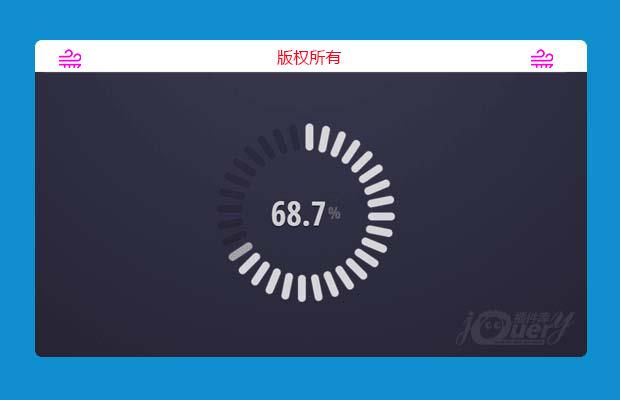
插件描述:这是一款效果非常炫酷的HTML5可交互的圆形进度条特效。这个圆形进度条由32个圆角矩形组成,用户可以点击每一个圆角矩形将进度条设置到相应的刻度上。它使用js来制作交互动画效果,并带有鼠标滑过时的效果,非常的酷。
制作方法
HTML结构
组成这个圆形进度条的32个圆角矩形每一个实际上是input.radio和<label>的组合。div.barPie__value用于显示当前进度的百分比值。包裹容器中的data-to-value用于圆形进度条的初始值。
1 2 3 4 5 6 7 8 | <div data-to-value='85' data-items-count='32' id="p1_barPie" class="barPie barPie--radio"> <span class="barPie__value">0</span> <div class="barPie__ring"> <input type="radio" name="barPieRadioGroup" id="p1_barPieItem31" value="100" hidden="hidden"/> <label for="p1_barPieItem31" class="barPie__ring__item"></label> ...... </div></div> |
CSS样式
整个圆形进度条设置了固定的宽度和高度,并设置居中显示。
1 2 3 4 5 6 7 8 9 10 11 12 13 | .barPie--radio { margin: 20px; width: 400px; height: 400px; text-align: center; font: 700 50px 'Open Sans Condensed', sans-serif; position: absolute; top: 0; left: 0; bottom: 0; right: 0; margin: auto;} |
并使用perspective属性来制作透视效果。
1 2 3 4 | .barPie { -webkit-perspective: 1000px; perspective: 1000px;} |
所有的圆角矩形都是由<label>元素来制作,通过将它们进行不同角度的旋转,组成一个圆形。
1 2 3 4 5 6 7 8 9 10 11 12 13 14 15 16 17 18 19 20 21 22 23 | .barPie__ring__item { position: absolute; width: 34px; height: 50%; top: 0; left: 50%; margin-left: -17px; -webkit-transform-origin: 50% 100%; -ms-transform-origin: 50% 100%; transform-origin: 50% 100%; -webkit-transition: .1s; transition: .1s;} .barPie__ring__item:nth-of-type(1) { -webkit-transform: rotate(11.25deg); -ms-transform: rotate(11.25deg); transform: rotate(11.25deg);}.barPie__ring__item:nth-of-type(1)::before { -webkit-transition-delay: 12ms; transition-delay: 12ms;}... |
<label>元素的:before伪元素用于制作圆角矩形的槽,它们的颜色被设置为0.15透明度的白色。并在鼠标滑过时设置它们的透明度为0.7,它的兄弟节点的透明度为0.4。
1 2 3 4 5 6 7 8 9 10 11 12 13 14 15 16 17 18 19 20 | .barPie__ring__item::before { content: ''; display: block; width: 50%; height: 30%; border-radius: 10px; background: rgba(0, 0, 0, 0.15); box-shadow: 0 0 0 1px rgba(255, 255, 255, 0.05), 0 0 4px rgba(0, 0, 0, 0.33) inset; -webkit-transition: .3s; transition: .3s;}.barPie__ring__item:hover::before { opacity: .7;}.barPie__ring__item:hover::before,.barPie__ring__item:hover ~ .barPie__ring__item::before { background: rgba(255, 255, 255, 0.4); -webkit-transition: 0s !important; transition: 0s !important;} |
处于checked状态的圆角矩形设置为80%透明度的白色。
1 2 3 4 5 6 | .barPie__ring :checked ~ .barPie__ring__item::before { background: rgba(255, 255, 255, 0.8); box-shadow: 0 0 4px rgba(255, 255, 255, 0.5); -webkit-transition: 0s; transition: 0s;} |
具体的javascript实现代码请参考下载文件。
特别申明:
本站所有资源都是由网友投稿发布,或转载各大下载站,请自行检测软件的完整性!
本站所有资源仅供学习与参考,请勿用于商业用途,否则产生的一切后果将由您自己承担!
如有侵权请联系我们删除下架,联系方式:lei1294551502@163.com
- 上一个特效: CSS3和js超酷iPhone样式科学计算器插件
- 下一个特效: css3画板