插件描述:每种效果在鼠标滑过卡片时,通过CSS3使图片和HTML元素变形生成 非常漂亮的鼠标滑过动画特效。
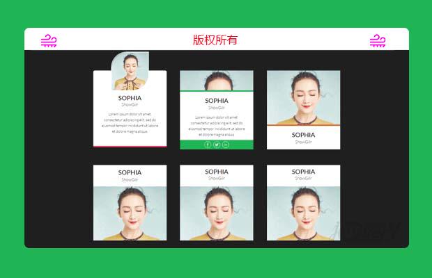
这是一组纯CSS3人物信息卡片UI设计效果。这组人物信息卡片共9种效果,每种效果在鼠标滑过卡片时,通过CSS3使图片和HTML元素变形生成 非常漂亮的鼠标滑过动画特效。
使用方法
HTML结构
该人物信息卡片的基本HTML结构如下:
1 2 3 4 5 6 7 8 9 10 11 12 13 14 15 | <div class="single-member effect-3"> <div class="member-image"> <img src="demo.jpg" alt=""> </div> <div class="member-info"> <h3>标题</h3> <h5>子标题</h5> <p>描述信息...</p> <div class="social-touch"> <a class="fb-touch" href="#"></a> <a class="tweet-touch" href="#"></a> <a class="linkedin-touch" href="#"></a> </div> </div></div> |
CSS样式
为卡片添加一些通用样式:
1 2 3 4 5 6 7 8 9 10 11 12 13 14 15 16 17 18 19 20 21 22 23 24 25 26 27 28 29 30 31 32 33 34 35 36 37 38 39 40 41 42 43 44 45 46 47 48 49 50 51 52 53 54 55 56 57 58 59 60 61 62 63 64 | .single-member{ width: 280px; float: left; font-family: sans-sarif; margin: 30px 2.5%; background-color: #fff; text-align: center; position: relative;}.member-image img{ max-width: 100%; vertical-align: middle;}h3 { font-size: 24px; font-weight: normal; margin: 10px 0 0; text-transform: uppercase;}h5 { font-size: 16px; font-weight: 300; margin: 0 0 15px; line-height: 22px;}p {font-size: 14px; font-weight: 300; line-height: 22px; padding: 0 30px; margin-bottom: 10px;}.social-touch a{ display: inline-block; width: 27px; height: 26px; vertical-align: middle; margin: 0 2px; background-image: url(images/social-icons.png); background-repeat: no-repeat; opacity: 0.7; transition: 0.3s;}.social-touch a:hover{ opacity: 1; transition: 0.3s;}.fb-touch{ background-position: 0 0;}.tweet-touch{ background-position: -35px 0;}.linkedin-touch{ background-position: -71px 0;}.icon-colored .fb-touch{ background-position: 0 -27px;}.icon-colored .tweet-touch{ background-position: -35px -27px;}.icon-colored .linkedin-touch{ background-position: -71px -27px;} |
第三种效果的CSS代码如下:
1 2 3 4 5 6 7 8 9 10 11 12 13 14 15 16 17 18 19 20 21 22 23 24 25 26 27 28 29 30 31 32 33 34 35 36 37 38 39 40 41 42 43 44 | .effect-3{ max-height: 302px; min-height: 302px; overflow: hidden;}.effect-3 h3{ padding-top: 7px; line-height: 33px;}.effect-3 .member-image{ border-bottom: 5px solid #e5642b; transition: 0.4s; height: 212px; width: 100%; display: inline-block; float: none; vertical-align: middle;}.effect-3 .member-info{ transition: 0.4s;}.effect-3 .member-image img{ width: 100%; vertical-align: bottom;}.effect-3 .social-touch{ background-color: #e5642b; float: left; left: 0; bottom: 0; overflow: hidden; padding: 5px 0; width: 100%; transition: 0.4s;}.effect-3:hover .member-image{ border-bottom: 0; border-radius: 0 0 50px 50px; height: 81px; display: inline-block; overflow: hidden; width: 109px; transition: 0.4s;} |
其它效果的CSS代码请参考下载文件。
特别申明:
本站所有资源都是由网友投稿发布,或转载各大下载站,请自行检测软件的完整性!
本站所有资源仅供学习与参考,请勿用于商业用途,否则产生的一切后果将由您自己承担!
如有侵权请联系我们删除下架,联系方式:lei1294551502@163.com
- 上一个特效: jQuery带视差切换效果幻灯片代码
- 下一个特效: jquery数字增加动画特效