CSS Glitch Effect
今天, 我们想向您展示如何在图像上创建一个小的实验性故障效果,该效果将由 CSS 动画和 "剪辑路径" 属性驱动。该技术涉及使用多个图层的图像, 其中每一个都有一个剪辑路径, 混合模式和翻译应用到它。它的灵感来自于404会议的发言者页上所看到的技术。
我们想试验这个,并使用clip-path属性重新创建效果。尽管浏览器支持较少(IE或Edge无法使用),但它允许使用更灵活的用法, 因为我们可以用百分比值并将其应用到不一定绝对定位的元素上。
结合背景混合模式的效果,使我们能够创造一些有趣的图像效果。
这种方式的工作原理是创建一个图像堆栈,其中每个重叠的图像将在其中的剪辑路径动画,看起来像随机大小。我们将使用一堆5个图像:
1 2 3 4 5 6 7 | <div class="glitch glitch--style-1"> <div class="glitch__img"></div> <div class="glitch__img"></div> <div class="glitch__img"></div> <div class="glitch__img"></div> <div class="glitch__img"></div></div> |
让我们看看在上一次演示中可以看到的悬停效果的主要样式。请注意, 我们以前已经定义了一些变量, 但它们应该是不言而喻的:
1 2 3 4 5 6 7 8 9 10 11 12 13 14 15 16 17 18 19 20 21 22 23 24 25 | .glitch { position: relative; width: var(--glitch-width); max-width: 400px; height: var(--glitch-height); max-height: calc(400px * 1.25); overflow: hidden; margin: 0 auto;}.glitch:hover { cursor: pointer;}.glitch__img { position: absolute; top: calc(-1 * var(--gap-vertical)); left: calc(-1 * var(--gap-horizontal)); width: calc(100% + var(--gap-horizontal) * 2); height: calc(100% + var(--gap-vertical) * 2); background: url(../img/1.jpg) no-repeat 50% 0; background-color: var(--blend-color-1); background-size: cover; background-blend-mode: var(--blend-mode-1);} |
我们不希望显示双方被切断,所以我们确保图像尺寸的差距,即移动的考虑。
然后,我们为每个图层设置背景颜色和混合模式:
1 2 3 4 5 6 7 8 9 10 11 12 13 14 15 16 17 18 19 20 | /* Set the background colors for the glitch images*/.glitch__img:nth-child(2) { background-color: var(--blend-color-2); background-blend-mode: var(--blend-mode-2);}.glitch__img:nth-child(3) { background-color: var(--blend-color-3); background-blend-mode: var(--blend-mode-3);}.glitch__img:nth-child(4) { background-color: var(--blend-color-4); background-blend-mode: var(--blend-mode-4);}.glitch__img:nth-child(5) { background-color: var(--blend-color-5); background-blend-mode: var(--blend-mode-5);} |
由于这将是一个悬停效果,我们希望除第一个层以外的所有层都默认隐藏:
1 2 3 | .glitch__img:nth-child(n+2) { opacity: 0;} |
然后,在悬停,我们显示所有图层:
1 2 3 | .glitch:hover .glitch__img:nth-child(n+2) { opacity: 1;} |
我们还将动画和变换应用到每个图层:
1 2 3 4 5 6 7 8 9 10 11 12 13 14 15 16 17 18 19 | .glitch:hover .glitch__img:nth-child(2) { transform: translate3d(var(--gap-horizontal),0,0); animation: glitch-anim-1-horizontal var(--time-anim) infinite linear alternate;}.glitch:hover > .glitch__img:nth-child(3) { transform: translate3d(calc(-1 * var(--gap-horizontal)),0,0); animation: glitch-anim-2-horizontal var(--time-anim) infinite linear alternate;}.glitch:hover > .glitch__img:nth-child(4) { transform: translate3d(0, calc(-1 * var(--gap-vertical)), 0) scale3d(-1,-1,1); animation: glitch-anim-3-horizontal var(--time-anim) infinite linear alternate;}/* Hover flash animation on last image */.glitch:hover > .glitch__img:nth-child(5) { animation: glitch-anim-flash 0.5s steps(1,end) infinite;} |
该calc(-1 * var(--gap-horizontal))基本上允许我们设置一个特定变量的负值。
最后一层只是闪烁并稍微移动,而其他层也被裁剪路径裁剪。
让我们来看看设置剪辑路径的动画之一:
1 2 3 4 5 6 7 8 9 10 11 12 13 14 15 16 17 18 19 20 21 22 23 24 25 26 27 28 29 30 31 32 33 34 35 36 37 38 39 40 41 42 43 44 45 46 | @keyframes glitch-anim-1-horizontal { 0% { -webkit-clip-path: polygon(0 2%, 100% 2%, 100% 5%, 0 5%); clip-path: polygon(0 2%, 100% 2%, 100% 5%, 0 5%); } 10% { -webkit-clip-path: polygon(0 15%, 100% 15%, 100% 15%, 0 15%); clip-path: polygon(0 15%, 100% 15%, 100% 15%, 0 15%); } 20% { -webkit-clip-path: polygon(0 10%, 100% 10%, 100% 20%, 0 20%); clip-path: polygon(0 10%, 100% 10%, 100% 20%, 0 20%); } 30% { -webkit-clip-path: polygon(0 1%, 100% 1%, 100% 2%, 0 2%); clip-path: polygon(0 1%, 100% 1%, 100% 2%, 0 2%); } 40% { -webkit-clip-path: polygon(0 33%, 100% 33%, 100% 33%, 0 33%); clip-path: polygon(0 33%, 100% 33%, 100% 33%, 0 33%); } 50% { -webkit-clip-path: polygon(0 44%, 100% 44%, 100% 44%, 0 44%); clip-path: polygon(0 44%, 100% 44%, 100% 44%, 0 44%); } 60% { -webkit-clip-path: polygon(0 50%, 100% 50%, 100% 20%, 0 20%); clip-path: polygon(0 50%, 100% 50%, 100% 20%, 0 20%); } 70% { -webkit-clip-path: polygon(0 70%, 100% 70%, 100% 70%, 0 70%); clip-path: polygon(0 70%, 100% 70%, 100% 70%, 0 70%); } 80% { -webkit-clip-path: polygon(0 80%, 100% 80%, 100% 80%, 0 80%); clip-path: polygon(0 80%, 100% 80%, 100% 80%, 0 80%); } 90% { -webkit-clip-path: polygon(0 50%, 100% 50%, 100% 55%, 0 55%); clip-path: polygon(0 50%, 100% 50%, 100% 55%, 0 55%); } 100% { -webkit-clip-path: polygon(0 70%, 100% 70%, 100% 80%, 0 80%); clip-path: polygon(0 70%, 100% 70%, 100% 80%, 0 80%); }} |
切片将从微小,变大一点,也不变,在一些帧上留下“暂停”,然后从另一个位置再次开始。
可视化剪辑路径的一个很棒的工具是Clippy by Bennett Feely。
最后的动画是最后一层的一个简单的闪光:
1 2 3 4 5 6 7 8 9 10 | @keyframes glitch-anim-flash { 0% { opacity: 0.2; transform: translate3d(var(--gap-horizontal), var(--gap-vertical), 0); } 33%, 100% { opacity: 0; transform: translate3d(0,0,0); }} |
当使用重叠的颜色作为合适的颜色时,看起来更有趣。
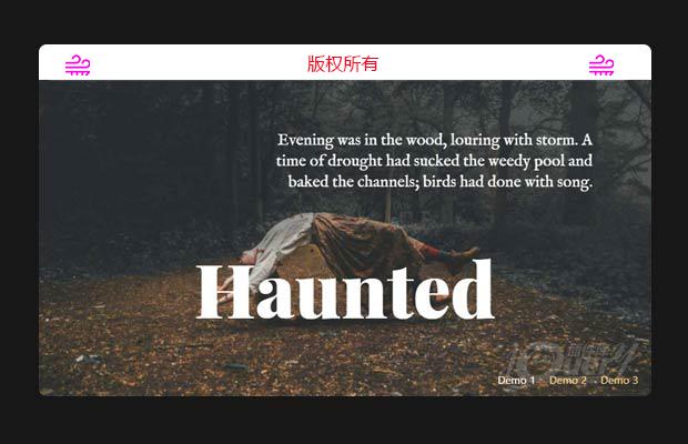
请注意,我们也可以将这个效果应用到文本元素。 看看演示,看看它做了什么!
而就是这样! 我们希望你在这个小实验中找到灵感。
特别申明:
本站所有资源都是由网友投稿发布,或转载各大下载站,请自行检测软件的完整性!
本站所有资源仅供学习与参考,请勿用于商业用途,否则产生的一切后果将由您自己承担!
如有侵权请联系我们删除下架,联系方式:lei1294551502@163.com
- 上一个特效: 下拉选择框美化插件selectFilter.js
- 下一个特效: 轻量级、自定义美化滚动条插件,兼容IE浏览器(原创)