插件描述:响应式jQuery消息框和通知插件可用于商业和非商业用途。
更新时间:2021-03-14 22:38:50
Lobibox分为两部分
消息框
通知
特点
Lobibox分为两部分
留言框
Lobibox消息框可以是模式的,也可以不是模式的
您可以同时显示多条消息
使用任何可用的动画类显示和隐藏消息框
每条消息都是可拖动的(在小屏幕上,禁止拖动)
你可以展示
不同颜色和图标的消息框
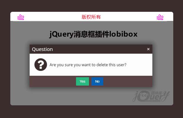
确认讯息
一行提示(提示窗口中可以使用任何HTML5输入类型。例如:文本,颜色,日期,日期时间,电子邮件,数字,范围等)
多行提示
进度消息框。 Lobibox带有默认进度样式,但是您可以使用引导程序或任何其他样式进度栏。
带有ajax支持和自定义操作按钮的自定义内容窗口
每个消息都是插件的一个实例。 您可以轻松地获取实例并将事件或调用方法直接附加到实例上。
通知事项
不同的颜色支持
可以在屏幕的任何位置显示
延迟
显示延迟指示器
显示图片
声音支持
尺寸支持。 您可以显示不同大小的通知
安装和依赖
Lobibox仅依赖jQuery。
1,包括必要的css/js文件
1 2 3 4 5 6 7 8 9 10 11 12 13 14 15 16 17 | <!DOCTYPE html><html><head> <!--Include this css file in the <head> tag --> <link rel="stylesheet" href="dist/css/Lobibox.min.css"/></head><body> ... <!--Include these script files in the <head> or <body> tag--> <script src="lib/jquery.1.11.min.js"></script> <script src="dist/js/Lobibox.min.js"></script> <!-- If you do not need both (messageboxes and notifications) you can inclue only one of them --> <!-- <script src="dist/js/messageboxes.min.js"></script> --> <!-- <script src="dist/js/notifications.min.js"></script> --></body></html> |
2,调用插件方法以显示消息框或通知
留言框
确认
1 | Lobibox.confirm({... //Options}); |
警报
1 2 3 4 5 6 | Lobibox.alert('error|success|warning|info', // Any of the following{ ... //Options}); |
迅速的
1 2 3 4 5 | Lobibox.prompt('', // Any HTML5 input type is valid{ ... //Options}); |
进步
1 2 3 | Lobibox.progress({... //Options}); |
窗户
1 2 3 | Lobibox.window({... //Options}); |
选项
所有消息框的默认选项
1 2 3 4 5 6 7 8 9 10 11 12 13 14 15 16 17 18 19 20 21 22 | horizontalOffset: 5, //If the messagebox is larger (in width) than window's width. The messagebox's width is reduced to window width - 2 * horizontalOffsetverticalOffset: 5, //If the messagebox is larger (in height) than window's height. The messagebox's height is reduced to window height - 2 * verticalOffsetwidth: 600,height: 'auto', // Height is automatically calculated by widthcloseButton: true, // Show close button or notdraggable: false, // Make messagebox draggablecustomBtnClass: 'lobibox-btn lobibox-btn-default', // Class for custom buttonsmodal: true,debug: false,buttonsAlign: 'center', // Position where buttons should be alignedcloseOnEsc: true, // Close messagebox on Esc pressdelayToRemove: 200, // Time after which lobibox will be removed after remove call. (This option is for hide animation to finish)delay: false, // Time to remove lobibox after shownbaseClass: 'animated-super-fast', // Base class to add all messageboxesshowClass: 'zoomIn', // Show animation classhideClass: 'zoomOut', // Hide animation classiconSource: 'bootstrap', // "bootstrap" or "fontAwesome" the library which will be used for icons//Overriding default optionsLobibox.base.DEFAULTS = $.extend({}, Lobibox.base.DEFAULTS, {... //override any options from default options}); |
所有消息框的可用选项
1 2 3 4 5 6 7 8 9 10 11 12 13 14 15 16 17 18 19 20 21 22 23 24 25 26 27 28 29 30 31 32 33 34 35 36 | Lobibox.base.OPTIONS = {//DO NOT change this value. Lobibox depended on itbodyClass : 'lobibox-open',//DO NOT change this object. Lobibox is depended on itmodalClasses : { 'error' : 'lobibox-error', 'success' : 'lobibox-success', 'info' : 'lobibox-info', 'warning' : 'lobibox-warning', 'confirm' : 'lobibox-confirm', 'progress' : 'lobibox-progress', 'prompt' : 'lobibox-prompt', 'default' : 'lobibox-default', 'window' : 'lobibox-window'},//This is option how buttons can be shown. What are buttonsAlign option available valuesbuttonsAlign: ['left', 'center', 'right'],//You can change the title or class of buttons from here or use the same structure object for button when creating messagebox//closeOnClick : true will close the messagebox when clicking this type of button. Set it to false not to close messagebox when clicking on itbuttons: { ok: { 'class': 'lobibox-btn lobibox-btn-default', text: 'OK', closeOnClick: true }, cancel: { 'class': 'lobibox-btn lobibox-btn-cancel', text: 'Cancel', closeOnClick: true }, yes: { 'class': 'lobibox-btn lobibox-btn-yes', text: 'Yes', closeOnClick: true }, no: { 'class': 'lobibox-btn lobibox-btn-no', text: 'No', closeOnClick: true }},icons: { bootstrap: { confirm: 'glyphicon glyphicon-question-sign', success: 'glyphicon glyphicon-ok-sign', error: 'glyphicon glyphicon-remove-sign', warning: 'glyphicon glyphicon-exclamation-sign', info: 'glyphicon glyphicon-info-sign' }, fontAwesome: { confirm: 'fa fa-question-circle', success: 'fa fa-check-circle', error: 'fa fa-times-circle', warning: 'fa fa-exclamation-circle', info: 'fa fa-info-circle' }}};//Overriding default optionsLobibox.base.OPTIONS = $.extend({}, Lobibox.base.OPTIONS, {... //override any options except those above which is written "DO NOT change"}); |
确认的默认选项
1 2 3 4 5 6 7 | title : 'Question',width : 500,//Overriding default optionsLobibox.confirm.DEFAULTS = $.extend({}, Lobibox.confirm.DEFAULTS, {... //override any options from default options}); |
提示的默认选项
1 2 3 4 5 6 7 8 9 10 11 12 13 14 | width: 400,attrs : {}, // Plain object of any valid attribute of input fieldvalue: '', // Value which is given to textfield when messagebox is createdmultiline: false, // Set this true for multiline promptlines: 3, // This works only for multiline prompt. Number of linestype: 'text', // Prompt type. Available types (text|number|color)label: '' // Set some text which will be shown exactly on top of textfieldrequired: true,errorMessage: 'The field is required'//Overriding default optionsLobibox.prompt.DEFAULTS = $.extend({}, Lobibox.prompt.DEFAULTS, {... //override any options from default options}); |
特别申明:
本站所有资源都是由网友投稿发布,或转载各大下载站,请自行检测软件的完整性!
本站所有资源仅供学习与参考,请勿用于商业用途,否则产生的一切后果将由您自己承担!
如有侵权请联系我们删除下架,联系方式:lei1294551502@163.com
- 上一个特效: 原生js移动端字母索引列表(原创)
- 下一个特效: jQuery bootstraps响应式企业公司类网站模板