插件描述:基于vue-drag-verify二次开发的vue组件,一款满足日常使用的vue滑块验证组件
更新时间:2020-02-04 23:03:00
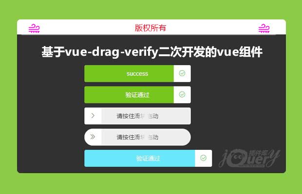
基于vue-drag-verify二次开发的vue组件
需对父元素或html设置user-select: none
使用方法
1 2 3 4 5 6 7 8 9 10 11 12 13 14 15 16 | import dragVerify from 'dragVerify'export default { name: 'app', components:{ dragVerify }}<drag-verify ref="dragVerify" :isPassing.sync="isPassing2" text="请按住滑块拖动" successText="验证通过" handlerIcon="el-icon-d-arrow-right" successIcon="el-icon-circle-check" ></drag-verify> |
属性
| width | 宽度 | number | - | 250 |
| height | 高度 | number | - | 40 |
| text | 初始文字 | string | - | swiping to the right side |
| successText | 成功提示文字 | string | - | success |
| background | 滑块右侧背景色 | string | #eee / red / rgba(52,52,52,0.7) | #eee |
| progressBarBg | 滑块左侧背景色 | string | #76c61d / white / rgba(52,52,52,0.7) | #76c61d |
| handlerBg | 滑块背景色 | string | #fff / white / rgb(255,255,255) | #fff |
| completedBg | 验证通过背景色 | string | #76c61d / white / rgba(52,52,52,0.7) | #76c61d |
| circle | 两侧是否圆形 | boolean | true / false | false |
| radius | 圆角 | string | 4px / 4% | 4px |
| handlerIcon | 滑块未验证通过时的图标,根据所选框架设置不同class | string | el-icon-d-arrow-right | - |
| successIcon | 滑块验证通过时的图标,根据所选框架设置不同class | string | el-icon-circle-check | - |
| textSize | 文字大小 | string | 14px / 4em | 14px |
| textColor | 文字颜色 | string | #333 / gray / rgb(52,52,52) | #333 |
Slots
| textBefore | 提示文字前 |
| textAfter | 提示文字后 |
方法
| reset | 还原未验证通过时的状态 | - |
特别申明:
本站所有资源都是由网友投稿发布,或转载各大下载站,请自行检测软件的完整性!
本站所有资源仅供学习与参考,请勿用于商业用途,否则产生的一切后果将由您自己承担!
如有侵权请联系我们删除下架,联系方式:lei1294551502@163.com
- 上一个特效: jQuery轮播图插件
- 下一个特效: jQuery九宫格抽奖(原创)