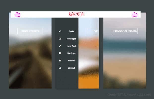
插件描述:这是一组共4种效果非常炫酷的CSS3移动手机滑动隐藏侧边栏菜单特效。这四种效果分别是:默认的点击滑动侧边栏菜单效果、带3D transforms的滑动侧边栏效果、文字缩放和淡入淡出效果的滑动侧边栏以及使用translate来实现滑动侧边栏的效果。
这是一组共4种效果非常炫酷的CSS3移动手机滑动隐藏侧边栏菜单特效。这四种效果分别是:默认的点击滑动侧边栏菜单效果、带3D transforms的滑动侧边栏效果、文字缩放和淡入淡出效果的滑动侧边栏以及使用translate来实现滑动侧边栏的效果。
每一个滑动侧边栏效果都带有从右到左淡入淡出的滑动过渡效果。菜单栏中的菜单项以一个接一个的方式显示,这种效果是通过为它们分别添加 transition-delay 来实现的。下面来看看默认的滑动侧边栏效果的制作方法。
HTML结构
所有滑动侧边栏效果都是使用无序列表来制作的,在默认的实现中,将无序列表包装到class为mobile的div中,为了便于控制,外围还添加了一个wrapper包裹div。这个DEMO使用纯CSS制作,按钮使用的是一个checkbox输入框来制作。插件中使用了font-awesome图标字体
1 2 3 4 5 6 7 8 9 10 11 12 13 14 15 16 17 18 19 20 21 22 23 24 25 26 27 28 29 30 31 32 33 34 35 36 37 38 39 40 41 42 43 44 45 46 47 48 49 50 51 52 53 54 55 56 57 58 59 60 61 62 63 64 65 66 67 68 69 70 71 72 73 | <div id="wrapper"> <h2> Off Canvas Menu with Animated Links </h2> <div class="mobile"> <!-- Checkbox to toggle the menu --> <input type="checkbox" id="tm" /> <!-- The menu --> <ul class="sidenav"> <li> <a href="#"> <i class="fa fa-check"> </i> <b> Tasks </b> </a> </li> <li> <a href="#"> <i class="fa fa-inbox"> </i> <b> Messages </b> </a> </li> <li> <a href="#"> <i class="fa fa-pencil"> </i> <b> New Post </b> </a> </li> <li> <a href="#"> <i class="fa fa-cog"> </i> <b> Settings </b> </a> </li> <li> <a href="#"> <i class="fa fa-star"> </i> <b> Starred </b> </a> </li> <li> <a href="#"> <i class="fa fa-power-off"> </i> <b> Logout </b> </a> </li> </ul> <!-- Content area --> <section> <!-- Label for #tm checkbox --> <label for="tm"> Click Me </label> </section> </div></div> |
CSS样式
整个包裹div被设置为相对定位,并为其设置左浮动和阴影效果。
1 2 3 4 5 | .mobile { float: left; position: relative; box-shadow: 0 0 25px 0 rgba(0, 0, 0, 0.5); overflow: hidden;} |
这里的按钮制作使用了一个小技巧。作为按钮的checkbox被设置为隐藏状态,然后在<section>元素使用一个<label>元素来和它关联,将<label>制作为按钮样式,实际在点击<label>时,相当于点击了checkbox按钮。
/*Hiding the checkbox*/

#tm {
    display: none;
}

.mobile section label {

    color: white;
    font: bold 14px Montserrat;
    text - align: center;

    border: 2px solid white;
    border - radius: 4px;

    display: block;
    padding: 10px 0;

    width: 60 % ;
    position: absolute;
    left: 20 % ;
    top: 100px;

    cursor: pointer;
    text - transform: uppercase;

}
按钮的点击使用了checkbox hack 技术。
/*Animate content area to the right*/
#tm:checked ~ section {transform: translateX(150px);}
/*Animate links from right to left + fade in effect*/
#tm:checked ~ .sidenav b {opacity: 1; transform: translateX(0);}
最后,为每个滑动侧边栏菜单项添加一些延迟来制作一个接一个出现的效果:
1 2 3 4 5 6 | #tm:checked ~ .sidenav li:nth-child(1) b {transition-delay: 0.08s;}#tm:checked ~ .sidenav li:nth-child(2) b {transition-delay: 0.16s;}#tm:checked ~ .sidenav li:nth-child(3) b {transition-delay: 0.24s;}#tm:checked ~ .sidenav li:nth-child(4) b {transition-delay: 0.32s;}#tm:checked ~ .sidenav li:nth-child(5) b {transition-delay: 0.40s;}#tm:checked ~ .sidenav li:nth-child(6) b {transition-delay: 0.48s;} |
特别申明:
本站所有资源都是由网友投稿发布,或转载各大下载站,请自行检测软件的完整性!
本站所有资源仅供学习与参考,请勿用于商业用途,否则产生的一切后果将由您自己承担!
如有侵权请联系我们删除下架,联系方式:lei1294551502@163.com