插件描述:ANIMATED BUTTONS 室用css3打造的一款多种动画样式的按钮,它的灵感来自于作者想用不同的样式创造一些动态的链接元素,鼠标移动到按钮上和激活按钮都呈现不同的样式。
ANIMATED BUTTONS 室用css3打造的一款多种动画样式的按钮,它的灵感来自于作者想用不同的样式创造一些动态的链接元素,鼠标移动到按钮上和激活按钮都呈现不同的样式。
接下来我们就来说明每个按钮的效果是怎么来实现的,也可参见示例下载中的源码
Demo1 的实现过程
AnimatedButtons_01
1、html代码
1 2 3 4 5 6 | <a href="#" class="a-btn"> <span class="a-btn-slide-text">$29</span> <img src="images/icons/1.png" alt="Photos" /> <span class="a-btn-text"><small>Available on the Apple</small> App Store</span> <span class="a-btn-icon-right"><span></span></span></a> |
2、按钮样式
1 2 3 4 5 6 7 8 9 10 11 12 13 14 15 16 17 18 19 20 21 22 23 24 25 26 27 28 29 30 31 32 33 34 35 36 37 38 39 40 41 42 43 44 45 46 47 48 49 50 51 52 53 54 55 56 57 58 59 60 61 62 63 64 65 66 67 68 69 70 71 | .a-btn{ background: linear-gradient(top, #a9db80 0%,#96c56f 100%); padding-left: 90px; padding-right: 105px; height: 90px; display: inline-block; position: relative; border: 1px solid #80ab5d; box-shadow: 0px 1px 1px rgba(255,255,255,0.8) inset, 1px 1px 3px rgba(0,0,0,0.2); border-radius: 4px; float: left; clear: both; margin: 10px 0px; overflow: hidden; transition: box-shadow 0.3s ease-in-out;}.a-btn img{ position: absolute; left: 15px; top: 13px; border: none; transition: all 0.3s ease-in-out;}.a-btn .a-btn-slide-text{ position: absolute; font-size: 36px; top: 18px; left: 18px; color: #6d954e; opacity: 0; text-shadow: 0px 1px 1px rgba(255,255,255,0.4); transition: opacity 0.2s ease-in-out;}.a-btn-text{ padding-top: 13px; display: block; font-size: 30px; text-shadow: 0px -1px 1px #80ab5d;}.a-btn-text small{ display: block; font-size: 11px; letter-spacing: 1px;}.a-btn-icon-right{ position: absolute; right: 0px; top: 0px; height: 100%; width: 80px; border-left: 1px solid #80ab5d; box-shadow: 1px 0px 1px rgba(255,255,255,0.4) inset;}.a-btn-icon-right span{ width: 38px; height: 38px; opacity: 0.7; border-radius: 20px; position: absolute; left: 50%; top: 50%; margin: -20px 0px 0px -20px; border: 1px solid rgba(0,0,0,0.5); background: #4e5c50 url(../images/arrow_down.png) no-repeat center center; box-shadow: 0px 1px 1px rgba(255,255,255,0.3) inset, 0px 1px 2px rgba(255,255,255,0.5); transition: all 0.3s ease-in-out;} |
3、鼠标移动到按钮上时的样式
1 2 3 4 5 6 7 8 9 10 11 12 13 14 15 16 17 18 19 20 21 22 23 24 | .a-btn:hover{ box-shadow: 0px 1px 1px rgba(255,255,255,0.8) inset, 1px 1px 5px rgba(0,0,0,0.4); }.a-btn:hover img{ transform: scale(10); opacity: 0;}.a-btn:hover .a-btn-slide-text,.a-btn:hover .a-btn-icon-right span{ opacity: 1;}4、鼠标按下时的css样式.a-btn:active { position:relative; top:1px; background:#80ab5d; box-shadow:1px 1px 2px rgba(0,0,0,0.4) inset; border-color: #a9db80;}.a-btn:active .a-btn-icon-right span{ transform: scale(1.4);} |
Demo2 的实现过程
AnimatedButtons_02
第二个效果其实和第一个效果有些类似,只是我们要加上一些不同的效果。
html代码和按钮样式都基本上是一样的,只是把颜色变一下即可,但是按钮的激活和覆盖样式是不一样的
3、当鼠标移动到按钮上时的样式为
1 2 3 4 5 6 7 8 9 10 11 12 13 14 15 16 17 18 19 20 21 22 23 24 25 26 27 | .a-btn:hover{ box-shadow: 0px 1px 1px rgba(255,255,255,0.8) inset, 1px 1px 5px rgba(0,0,0,0.4); }.a-btn:hover img{ opacity: 0;}.a-btn:hover .a-btn-slide-text{ opacity: 1; transform: scale(1);}.a-btn:hover .a-btn-icon-right span{ opacity: 1; background-color: #bc3532;}4、鼠标按下时的样式为.a-btn:active { position: relative; top: 1px; background: #5d81ab; box-shadow: 1px 1px 2px rgba(0,0,0,0.4) inset; border-color: #80a9da;}.a-btn:active .a-btn-icon-right span{ transform: rotate(360deg);} |
Demo3 的实现过程
AnimatedButtons_03
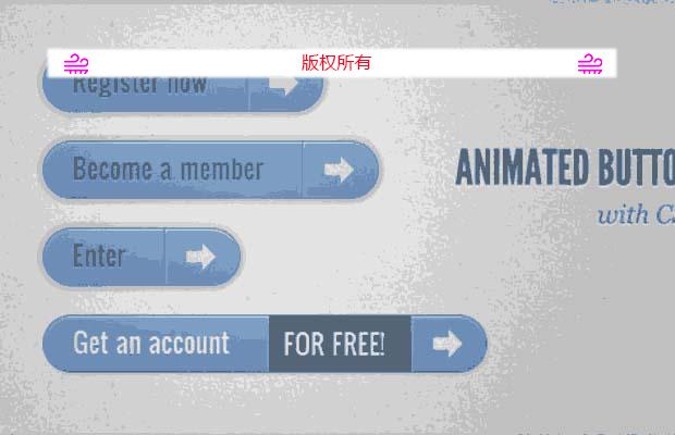
这个效果将会与上面的两个彻底的不一样了,当鼠标移动到按钮上时,按钮就会向下扩展并且显示另外一则信息,方向图标将会有一定程度的旋转。
1、html代码
<a href="/">
<span class="a-btn-text">Register now</span>
<span class="a-btn-slide-text">Get a promotion</span>
<span class="a-btn-icon-right"><span></span></span>
</a>
2、按钮样式
1 2 3 4 5 6 7 8 9 10 11 12 13 14 15 16 17 18 19 20 21 22 23 24 25 26 27 28 29 30 31 32 33 34 35 36 37 38 39 40 41 42 43 44 45 46 47 48 49 50 51 52 53 54 55 56 57 58 59 60 61 62 63 64 65 | .a-btn{ background: linear-gradient(top, #feda71 0%,#febb4a 100%); border: 1px solid #f5b74e; border-color: #f5b74e #e5a73e #d6982f; box-shadow: 0 1px 1px #d3d3d3, inset 0 1px 0 #fee395; padding: 0px 80px 0px 10px; height: 38px; display: inline-block; position: relative; border-radius: 4px; float: left; margin: 10px; overflow: hidden; transition: all 0.3s linear;}.a-btn-text{ padding-top: 5px; display: block; font-size: 18px; white-space: nowrap; color: #996633; text-shadow: 0 1px 0 #fedd9b; transition: all 0.3s linear;}.a-btn-slide-text{ position:absolute; top: 35px; left: 0px; width: auto; right: 52px; height: 0px; background: #fff; color: #996633; font-size: 13px; white-space: nowrap; font-family: Georgia, serif; font-style: italic; text-indent: 15px; overflow: hidden; line-height: 30px; box-shadow: -1px 0px 1px rgba(255,255,255,0.4), 1px 1px 1px rgba(0,0,0,0.5) inset; transition: height 0.3s linear;}.a-btn-icon-right{ position: absolute; right: 0px; top: 0px; height: 100%; width: 52px; border-left: 1px solid #f5b74e; box-shadow: 1px 0px 1px rgba(255,255,255,0.4) inset;}.a-btn-icon-right span{ width: 38px; height: 38px; opacity: 0.7; position: absolute; left: 50%; top: 50%; margin: -20px 0px 0px -20px; background: transparent url(../images/arrow_right.png) no-repeat 50% 55%; transition: all 0.3s linear;} |
3、鼠标移动到按钮上时的样式
1 2 3 4 5 6 7 8 9特别申明:
本站所有资源都是由网友投稿发布,或转载各大下载站,请自行检测软件的完整性! 本站所有资源仅供学习与参考,请勿用于商业用途,否则产生的一切后果将由您自己承担! 如有侵权请联系我们删除下架,联系方式:lei1294551502@163.com |